Creating Ease Through Consolidation and a Purposeful Design System
Unifying a digital landscape for of the nations largest Protestant churches
Role
Duration
Team
Scope
Client
The Business Problem
The Solution
30%
94%
Web Excellence Award Winner
Best in Navigation and Search Season 15
Brand Voice as a Design Compass
We developed several design directions based on PC(USA)'s desired emotional qualities. This approach gave stakeholders a concrete, non-technical way to evaluate design decisions and ensured feedback remained aligned with organizational intent. Through this exercise and survey to the organization we were able to identify a set of rational and emotional brand values.
Useful, Accessible, Clear
Emotional Values
Engaging, Emotional, Approachable

ADA Compliance as Scope Clairty
We used WCAG and ADA guidelines as foundational design boundaries. For an audience spanning generations and digital fluency levels, including ESL users and older congregants, accessibility was essential. It influenced color, type, contrast, and interaction patterns throughout the site.
User Personas as Feature Filters
We evaluated every feature through the lens of the six validated user groups. Features that did not address a documented user need were excluded. This approach kept the scope manageable and provided a clear rationale for decisions, which was essential when balancing competing stakeholder priorities.
The Organizational Stakes
The denomination needed its digital presence to unify agency experiences, provide reliable access to resources, and re-establish the site as a meaningful tool for engagement rather than a source of frustration.
Understanding the Problem
My Role in the Research Phase
I translated research insights into design actions, led UI and concept ideation, developed the feature set, designed the navigation architecture, and managed design decisions through client presentations.
Existing Confusion
The PC(USA) web presence had grown into six disconnected agency sites, each with its own navigation and visual language, creating a fragmented experience that required insider knowledge to navigate. Critical resources were buried alongside outdated content with no clear hierarchy, making the site more of an obstacle than a tool for the people it was meant to serve.
What the Research Revealed
Discovery research, spanning 572 survey respondents and 14 user interviews, revealed a consistent theme across all user groups: the site felt confusing, exclusive, and unwelcoming. While frustration was universal, it manifested differently by persona, from worship leaders unable to find resources without knowing the responsible agency, to ESL users encountering limited and inconsistent multilingual content, to members who found the experience corporate rather than faith-centered.
“It is very difficult to find anything on the website. I get frustrated, and I know what I’m looking for. I can’t imagine what people in the pews think when they go to our websites.”
— Mid Council Member/Leader
The Core Insight
Across all personas, they missed the ability to find information quickly without insider knowledge of how the denomination was structured. This single insight reframed the entire design direction, shifting the site from an organizational chart to a user-centered experience.
“The website should have a clean, uncluttered look. The visitor of the site should come away feeling they easily found what they were looking for — with nuggets of information they weren’t necessarily looking for. They should come away with the thought that visiting this website was a rewarding experience and they want to revisit the site again and again.”
— Project Stakeholder Survey Response
Design
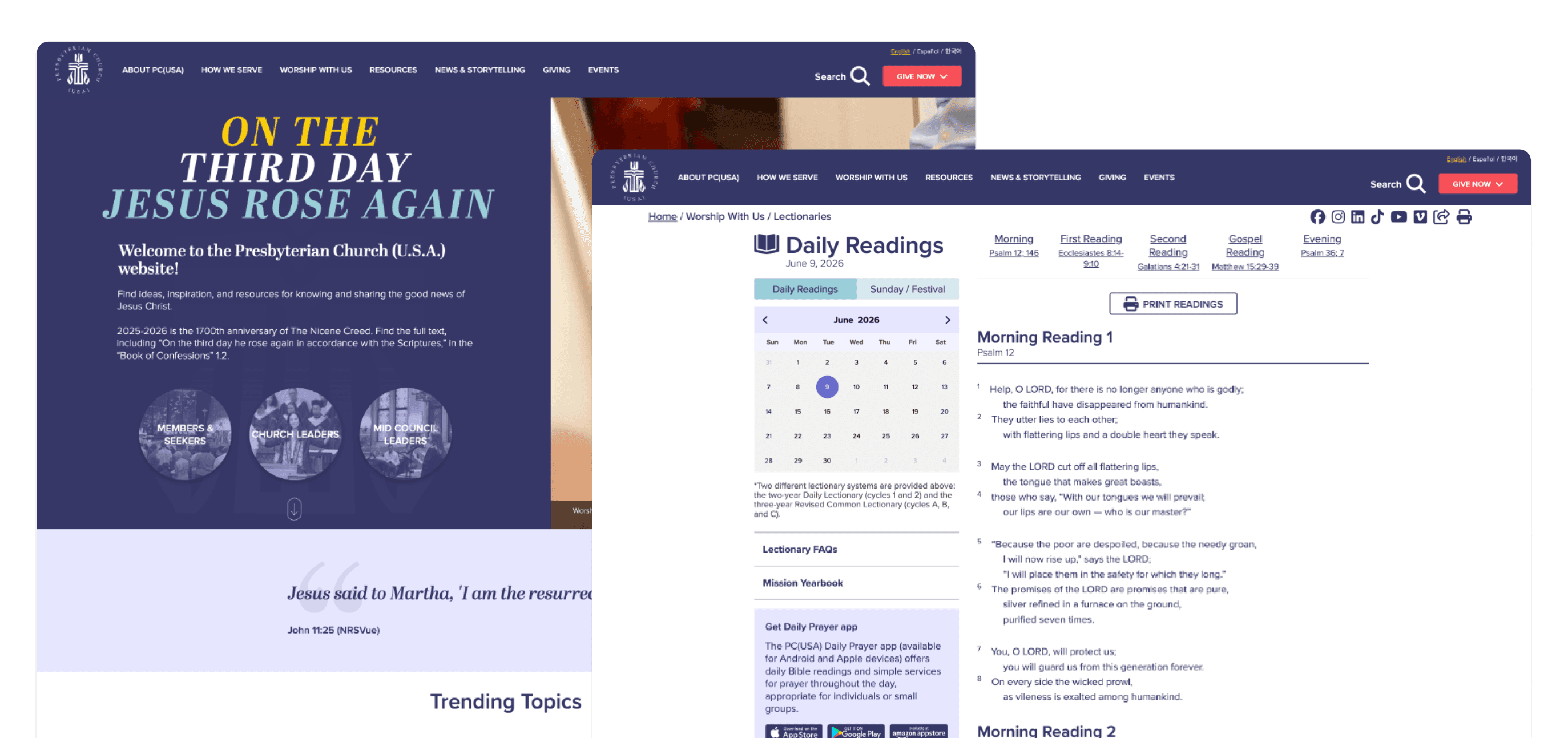
The Daily Lectionary: Clarity at the Most Visited Page
The Daily Lectionary is among the most visited pages. For congregation and worship leaders, it serves as a weekly touchpoint, but the previous design made this routine task unnecessarily difficult.
The design decision here was structural: a combination of calendar and tabular layouts to give users two intuitive ways to access content. Whether users preferred dates or scripture sequence, the page accommodated both. The visual design emphasized generous whitespace, high legibility, and minimal distractions.
Resources: What you need and how you think to find it
We redesigned the Resources section with smart search and card-based results to support users with lower reading fluency and ESL users who benefit from visual, scannable content. Preset filters provided starting points without requiring precise queries. The cards allowed users to preview content before downloading, addressing a major pain point identified in research.
Site-Wide Search: Flexible by Design
With content ranging from news articles to PDFs, worship resources, and policy documents, the site required a search tool capable of managing complexity without burdening the user.
We built a comprehensive search experience with multiple views and a preset-filtered view for users and an open search view for power users who know what they’re after. This is a flexible system designed to meet different users at their level of familiarity, from a first-time visitor to a mid council leader who visits multiple times a week.
We are also proud to say we submitted our designs to the Web Excellence awards and were awarded best in Navigation and Search for season 15.
The Solution
Navigation: Award-Winning Architecture
Navigation was a strategically significant and highly recognized deliverable. We designed an information architecture that removed agency boundaries and introduced user-role-based pathways. For the first time, worship leaders, mid council members, and first-time visitors could all arrive at the homepage and immediately find relevant paths. The navigation not only looked cleaner but also reflected a shift to an outward-facing digital presence.
Multilingual Support: Inclusion as Infrastructure
The new platform launched with full multilingual support across English, Spanish, and Korean. This decision directly addressed one of the organization’s core goals: a website that served the full breadth of its membership.
The Unified Experience
Fragmentation was resolved through a unified architecture. Inaccessibility was addressed through ADA-compliant design, multilingual support, and a navigation built for all literacy levels. And the site's feel, once rated as cold, elite, and exclusive by users across all personas, was redesigned to be approachable, clear, and genuinely useful. More importantly, users came back.